Designer Tips

Home / Portfolio / This & That / Designer Tips

The Eco Trend reaches Mallorca

Knox Design Furniture Stores in Mallorca

As a team of interior specialists at Knox Design, we are always on the lookout for the latest trends in home decor. One trend that has caught our attention is the increasing popularity of environmentally friendly furniture and home accessories. Not only are these products stylish and modern, but they also have a much smaller impact on the environment than traditional furniture and decor.

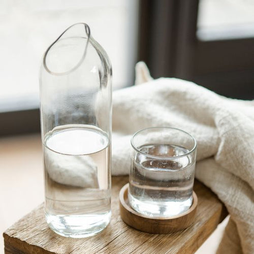
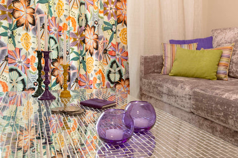
One specific aspect of this trend that we are particularly excited about is the growing use of recycled glass in home decor. In places like Zanzibar, where glass waste can be a major problem, local artisans are finding creative ways to turn waste into beautiful and functional objects.

Glass recycling in Zanzibar has been a priority for many years, with local communities and organizations working to collect and recycle glass bottles and other waste. This has led to a thriving industry of glass artisans who are transforming discarded glass into beautiful objects like vases, lamps, and decorative bowls. You will find some lovely options which we have sourced directly from the artisans ready for you to purchase in our store.

There are several reasons why environmentally friendly products are becoming more popular in the world of interior design. For one thing, people are becoming more aware of the impact that their choices have on the planet. With issues like climate change and pollution becoming more pressing every day, it's only natural that consumers are starting to prioritize eco-friendly products.

Another reason for the rise in popularity of eco-friendly furniture and decor is that many of these products are now just as stylish and fashionable as traditional products. In the past, environmentally friendly products may have been seen as dull or unattractive, but that is no longer the case. Many designers and manufacturers are now creating eco-friendly products that are every bit as stylish and modern as their traditional counterparts.

So what exactly makes a piece of furniture or home accessory "environmentally friendly"? There are several factors to consider. First and foremost, environmentally friendly products are made from sustainable materials. This means that the materials used to make the product are harvested or sourced in a way that is not damaging to the environment. For example, bamboo is a popular material for eco-friendly furniture because it is fast-growing and does not require the use of harmful pesticides or fertilizers.

In addition to sustainable materials, environmentally friendly products are also made using environmentally conscious manufacturing processes. This means that the manufacturing process is designed to minimize waste and reduce energy consumption. Many eco-friendly products are also made using recycled materials, which further reduces their environmental impact.

As interior specialists, we believe that incorporating environmentally friendly products into your home decor is not only good for the planet, but it also allows you to create a space that truly reflects your values and priorities. So why not consider incorporating some recycled glass pieces into your next design project? Not only will you be supporting a worthy cause, but you'll also be adding a touch of unique and sustainable style to your home. You will find several environmentally friendly products at Knox Design, our store in Son Bugadelles, the new “Mallorca Design District” in Calvia.

12 of the Best Movies for Interior Inspiration

One of the things that we all have in common during these months of lockdown is the amount of time spent at home watching films. Much of our inspiration when it comes to home décor hails from what we see in stores, magazines, other people’s homes, exhibitions…. So at a time when our usual stomping grounds and activities have been pared down to the bare minimum, films offer us a window to the world beyond our front doors, portraying a pre-COVID era when travel -let alone abroad, but just down the lane - were taken for granted. So let’s dream of new and different spaces and seek some inspiration for our interiors from the comfort of our couch.


ART DECO + ART NOUVEAU- LUXURIOUS OPULENCE

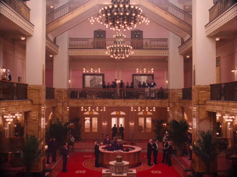
As a stark contrast to the ever-worrying images of hospital wards and testing laboratories, I suggest we begin with opulent decadence. Allow yourself to be swept away to the last years of the nineteenth century in Europe, so beautifully featured in the Grand Budapest Hotel (2014). Set in a vacant department store in Eastern Germany, the building was turned into a classic and sophisticated hotel, where the use of pastel colours infuses vibrancy and spirit in all the spaces: from the grandeur of the plush-carpeted lobby and majestic staircase to the globe lighting in corridors. Walls in cream or pink with accent hues of blue or red in rooms are classic of the Jugendstil style that blends traits of Art Deco and Art Nouveau to create a completely fresh rendition, where marble columns and crimson upholstery are combined with extraordinarily unusual items like the antler legged desk.


Moving a step up in terms of opulence and decadence, a must-watch is The Great Gatsby (2013), set in the roaring 20s and portraying the glitzy and superficial society of the Jazz age. Gatsby’s palatial early 20th century home in Long Island (NY) features a sweeping staircase, a gold-ceiling ballroom and one of the most amazing male dressing-rooms I have ever seen. Among the chandeliers that grace the luxuriously extravagant rooms is the Lagoon globe, made of pewter, glass and brass. The home uses ultra-glossy polished black furniture and mirrored pieces to bounce of the light. The mix of rare woods, shapely curved furniture lines and bold and angular geometric patterns make Jay Gatsby’s home a magnificent embodiment of luxury Art Deco.


If we then dare to mix Western sumptuousness with South Eastern splendour, we arrive at the Peranakan style featured in the film Crazy Rich Asians (2018), dating back to the first Chinese immigrants in the Malay peninsula. The décor has been described as “a unique combination of Chinese, English, Malaysian and Victorian” and the film itself has become known as “the Asian Gatsby”. It features floral and animal ornamentation, decorative mother-of-pearl inlays in furniture, glazed ceramic tiles, louvered shutters, William Morris design wallpaper indoors, all surrounded by luxuriant tropical gardens. A little OTT and perhaps a touch too eclectic for most tastes, the interiors featured in the family mansion of this film are a memorable flight of the imagination.

These first three examples have featured Art Deco in all its profusion, but this decorative style can also be manifested in a more subdued and toned-down manner. Leaving all the abundance of colour and oriental shades to one side, I recommend you watch Coco & Igor Stravinsky. The setting of the romance between the two characters in the title, Chanel’s the country house in Garches, on the outskirts of Paris, is a true reflection of her signature black and white palette. Black mouldings and window trims, furniture in chrome, glass and mirror and a fabulous gold and black dividing screen are all set against geometric patterned cubic wallpaper. Along with the white camellias in the garden, the home faithfully portrays the style and elegance of this fashion creator and icon with true French panache.


HIGH RISE CITY LUXURY FOR SINGLE RESIDENTS

Fashion and film and interior design, as in this previous example, are often intimately connected. This is the case with A Single Man, fashion designer Tom Ford’s film-making debut. It features a Modernist house in California which, like Coco’s country home, is meant to reflect the character of its dweller: meticulous, precise and detail-oriented. The home is minimalist and modern, featuring steel, glass, redwood and concrete. Its many glass walls flood the home with light, and invite us to take a look at his life and tribulations. Not a cosy, warm home by any means, but appealing nonetheless for those who believe that ‘less is more’.


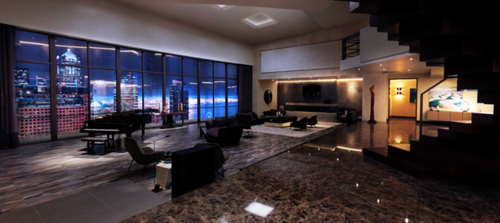
Another version of a home designed for a male resident is Christian Grey’s Seattle penthouse in Fifty Shades of Grey (2017). This super-luxurious flat features dark veined marble flooring and many sleek surfaces, like the burnished lift door and the high-sheen white sideboard. Statement pieces, like the brass ring and black aluminium table lamp and the gold leaf lacquered divider screen, and accent colours in the shape of a teal rug and deep green velvet curtains cut through the overall uniformity of muted tones of dark brown, old gold and grey. Breaking away from this décor theme is the Red Room, where sensual red fabrics and leather upholstery serve as the backdrop for the film’s iconic highly-charged scenes. Accessories are kept to a minimum and interest is fostered through sculptural forms and artwork.


While on the topic of snazzy apartments, lovers of the 1960s will be seduced by Down with Love (2003). Set in 1960s New York, the interiors featured in this film are replete with iconic designs of the time. It has been described as a candy-coloured pad, with its vivid bursts of colour and modern shaped furniture, such as the two pink Womb Chairs in the lounge. Designed by Evo Saarinen in 1948, it is meant to be “a chair that is like a basket full of pillows to curl up and read a book in”.


Pieces by this furniture designer are featured in 2001 Space Odyssey, a futuristic movie at the time. Saarinen’s round coffee table add a cool and modernist touch to the space age décor, combined with the red Djinn chairs by French designer Olivier Mourgue. These are interiors portraying the clash of the ages, with the bedroom featuring a white secretary desk, ornate gold armchairs and old gold satin bedding in an ultra-white space-age setting. Juxtaposition, that is, mixing elements from different ages, is often done in interior design; in the interiors of 2001 Space Odyssey, this juxtaposition is truly out of this world.


Let’s now descend from the uber-modern lofts and space age interiors, to earthier, warmer homes exuding country-chic. Take for example, the beautiful Villa Laura in Cortona (Italy), featured in the film Under the Tuscan Sun (2003). Its exquisite depiction of a typical country property in Tuscany earned it a nomination of the Art Directors Guild Excellence in Production Design Award. The storyline involves a makeover of a classic building, with its stuccoed walls, frescoes and rustic Italian charm. As an interior designer who has managed many renovation projects over the years, this film presents the pretty – albeit not entirely honest- side of refurbishment. The reality is a little more complicated, but the aesthetics of the film are nevertheless quite beautiful and inspiring.


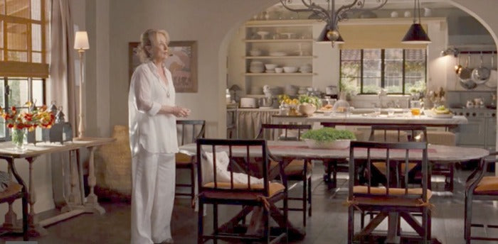
For a look at a home that has made many dream, watch It’s Complicated (2009). Meryl Streep’s house is a Spanish style 1920s Santa Barbara ranch home with Belgian inspired interiors. The kitchen in this film plays a very important role; huge and magnificent, it is very accommodating, with more than ample space for cooking and entertaining on a wooden table with curved arm dining chairs and open shelving featuring a lovely white set of dishware. Colonial terracotta tiled floors and warm wooden accents combine with the more European styled sitting room: plush sofas, pillows and throws in warm colours, fireplace, books and artwork. The main bedroom is soft and elegant, with warm coral and rose tones. A home of traditional, classic and heart-warming elegance.


And lastly, we arrive at the array of interiors that delight us in Eat Pray Love (2010), a film about a journey of self-discovery that takes us to Italy, India and Bali. The apartment in the heart of Rome features high ceilings, a cream palette and oversized windows, flooded with light. The greys and stones of the Italian city give way to the range of magentas, reds and purples of the heavily decorated altars in India, conjuring up interiors that are rich with vibrant hues so characteristic of this country, where I spent 3 glorious weeks with my family a few years ago, savouring colours, spices and rich architecture. The last destination featured in this film is Bali, specifically a palm thatched hut with an iron bed, a mosquito net and Balinese batik fabrics throughout. Simple living at its best in this romantic shelter, reminiscent also of the many diving holidays I have taken with my family in this part of the world. A film that brings together the old and the new, man-made sophistication and native simplicity in all its interiors.


As I mentioned at the start, we are all eager to be told good stories on film that carry us to other scenarios, far away from the greyness of the lockdown days of social distancing and no cultural events to stimulate and stir our senses. By adding this dimension to my viewing pleasure, I enjoy the narrative as much as the backdrop. An all-round experience to keep us all fresh, open to different styles of décor that might inspire us to make big or little changes to our homes.

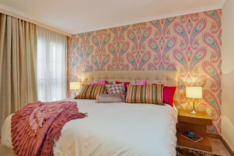
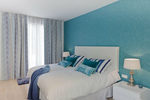
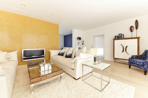
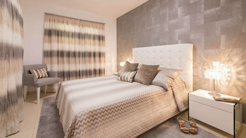
7 Quick Tips to inspire your very own Designer Feature Wall

Let me show you how to create a designer feature wall in your home.

I have put together some tips and images of some of my designs to give you some inspiration.

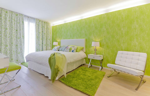
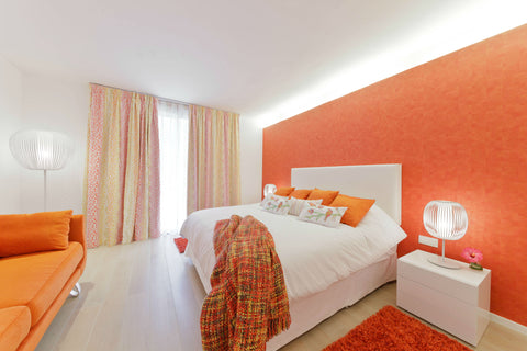
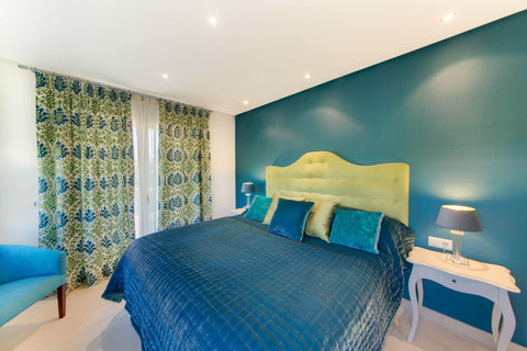
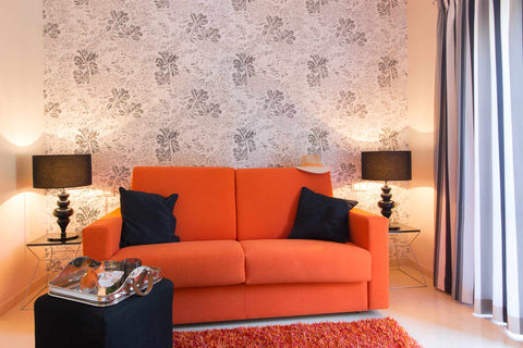
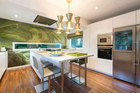
  • If you want to create the wow factor in your home, a feature wall is a quick and effective way to do this. Make sure that your chosen wall is suitably prepared and has no damp issues.
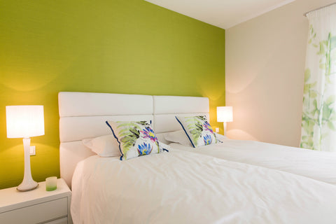
  • Work out which wall is the most dominant in your room.In a bedroom we often use the bed head wall, creating a backdrop for our headboards. In other rooms it needs to be a wall which is seen, it's no use adding a wonderful wall paper or panel to a wall which can only be seen from a difficult angle.
    The point of a feature wall is to grab the attention and really be seen, so don’t be shy.
  • In my designs over the years I have used many designer wall papers, paint finishes and wall panels and when ever possible I add lighting to make even more of a feature, if you are going to do it, do it well.
  • Adding pictures or art onto a feature wall needs to be done carefully in order to not detract from the wall covering, itself. I personally often choose to let the feature become the art.
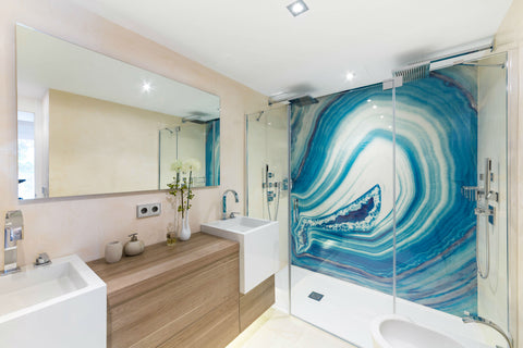
  • Some of the wall panels that I have used are a real investment as they are bespoke pieces and become part of the fittings but a paint finish or wall paper can save on costs and be a less risky option if you are not 100% sure.
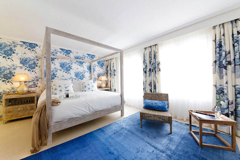
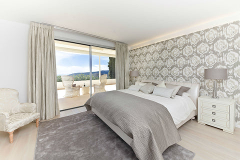
  • Choose a paper which shows your personality and colour scheme, dont be afraid to be bold with textures.
  • Finally, I strongly recommend using a professional to apply your chosen wall feature, as amateur mistakes can end in tears.

feature wall 1 feature wall 7 feature wall 5feature wall 9feature wall 8 feature wall 6feature wall 2feature wall 4feature wall 13feature wall 10feature wall 14feature wall 15feature wall 11feature wall 12 feature wall 15 feature wall 15feature wall 15feature wall 15feature wall 15feature wall 15feature wall 15feature wall 15feature wall 15feature wall 15feature wall 15feature wall 15

Justine's tips on adding colour to your Home Decor

I am a big fan of colour, and use it liberally in my own home and many of my interior design projects.

Villa Bendinat Living RoomVilla Bendiant Living Room Ambient


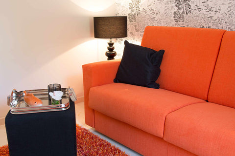
                                    I like to make a big splash of colour within my designs but if you are a colour beginner then start with the accessories.

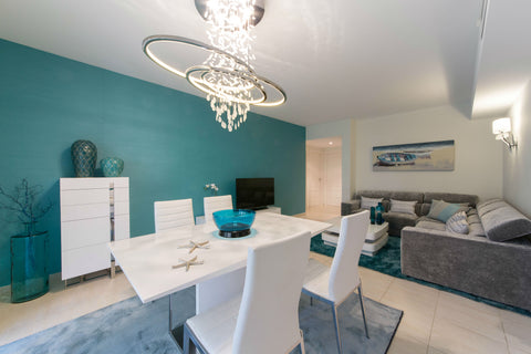
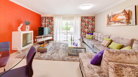
Keep the lightest colour or your neutral for walls and floors and introduce darker or more vibrant colours in smaller areas. A maximum of 3 colours is my rule but equally you can use shades of colours too. And keeping to a rule of 3 try to use a colour at least 3 times. For example, in your cushions, sofa blanket and art.

If in doubt about mixing colours and which colours would compliment each other, you could stick to a monochromatic colour scheme which consists of various shades of only one colour. You can also manipulate the size and shape of a room, using colour. Darker warm colours shrink space while Pale cool colours expand.


I also like to throw in a wild card colour if I am using a monochrome room scheme, an example of this would be a bright coloured chair or sofa in a black and white room. It really adds a pop of interest.

Villa Bendinat Black and White RoomVilla Bendinat Black and White Room Ambient

The great thing about colour is that you don’t always have to redecorate to get a colourful effect.

Just a little bit of know how, some accessories and a few updates can give you a great new look.

If you need help with your updates call in and see us at the Knox Design home store, we have brand new cushions and accessories available in store and our cosy coffee corner has all the latest home décor magazines for some inspiration.


Choosing the right materials for your Project.

Mixing it up in the right way and avoiding the wrong way.


The difference between a nice room and a well put together and interesting interior designed room is often in the details.

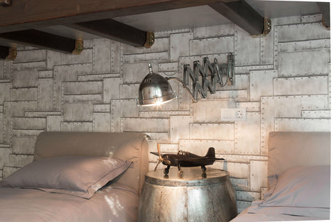
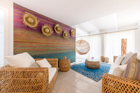
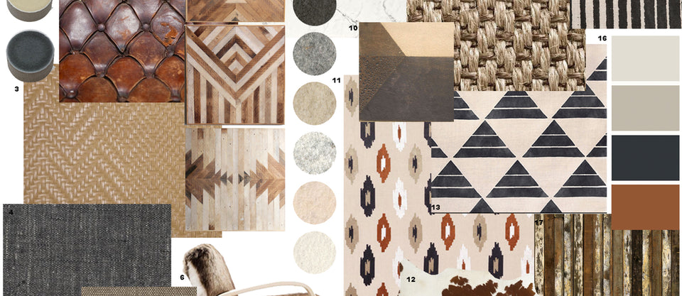
Textures play an important role in creating the right mood. Smooth and shiny for sleek minimalist moods and rough, matt and rustic textures if you are trying to achieve a relaxed casual mood.

If everything matches it becomes boring and uninteresting, aim to add some contrast in textures but without going over the top. For example if everything is shiny, marble floors, glass tables, high gloss furniture and satin fabrics it can be too much, so by using some matt finishes which could be in a rug, fabrics used and natural wood we are adding interest without bold colours or patterns.

Speaking of patterns, of course this is the simplest way to inject interest into a room. However be careful not to add too many different patterns as this can become confusing and overstimulating. A maximum of 3 or 4 is a good rule to follow and try to keep them within the same colour code.

"Don´t play it too safe, by adding a few brave elements you will take your room to the next level." Justine Knox

For more advice book a consultation visit with one of our experts.

Keeping up with the latest Home Design Trends

Keeping up with the latest trends is really important.

Justine and the team at Knox Design are always present at the national and international trade fairs throughout the year. These events in home furnishing and interior design give us new inspiration and the latest trends and styles each year for your homes and allow us to bring back the very latest for our home stores and website.

The trade fairs showcase the best every year in décor, fabrics, furniture, fragrances, table arrangements, children’s furnishings …
It is much more than a display of services and products: it is the heart of home fashion and Knox Design are well aware of its significance, we never miss these important events.