Colour of the Year

Home / Portfolio / This & That / Colour of the Year

Colour of the Year 2021

Colour of the Year 2021

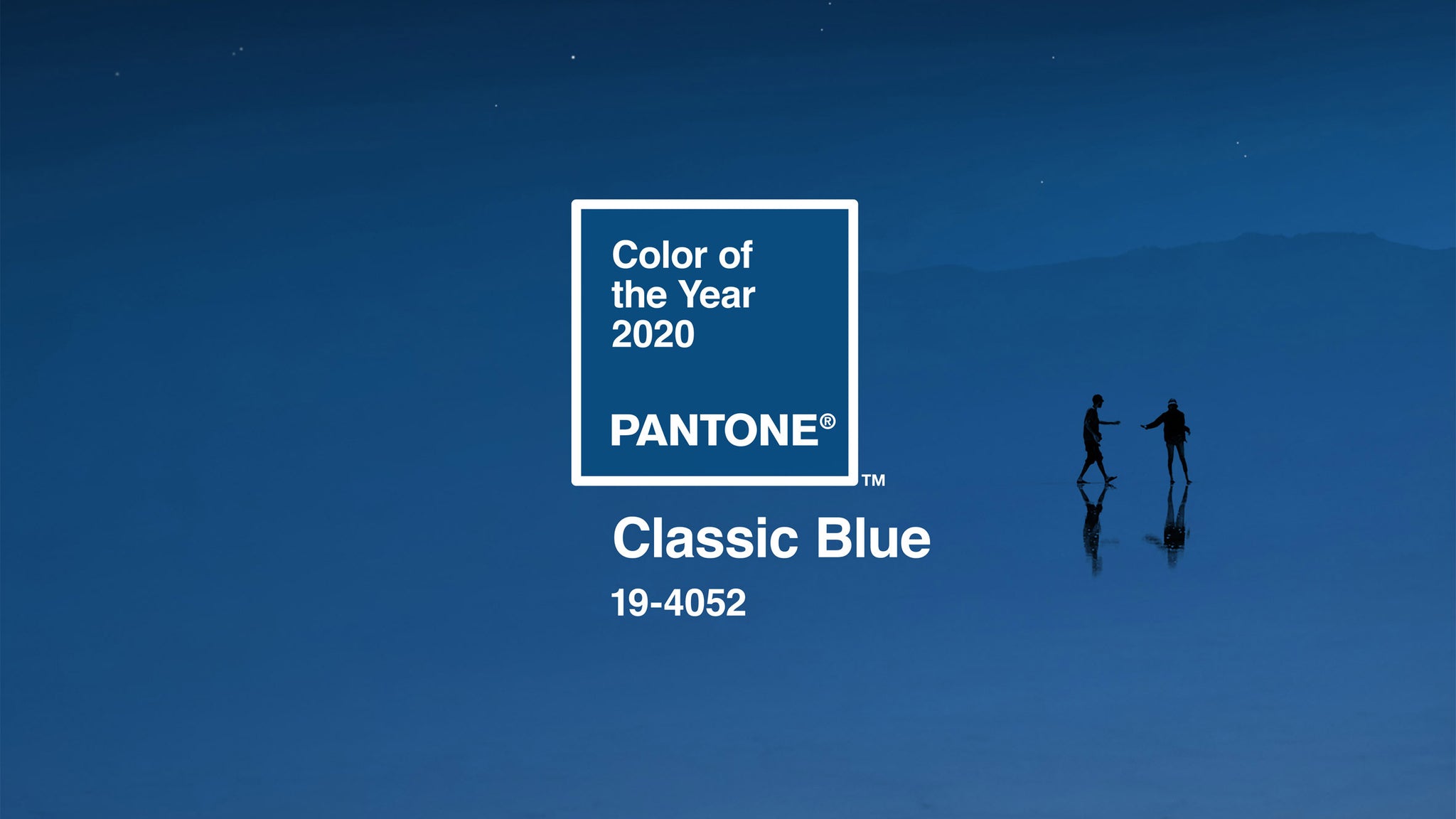
PANTONE 17-5104 Ultimate Gray & PANTONE 13-0647 Illuminating

For the second time in its 20 year history, PANTONE have chosen two hues for a single year. They decided that the unprecedented circumstances of the times we are living in merited more than one: a buttercup yellow called Illuminating to spell optimism and sunshine, and a grey tone known as Ultimate Grey to evoke composure, resilience and steadiness. A chromatic coupling designed to bring us happiness and strength in equal measure during 2021.

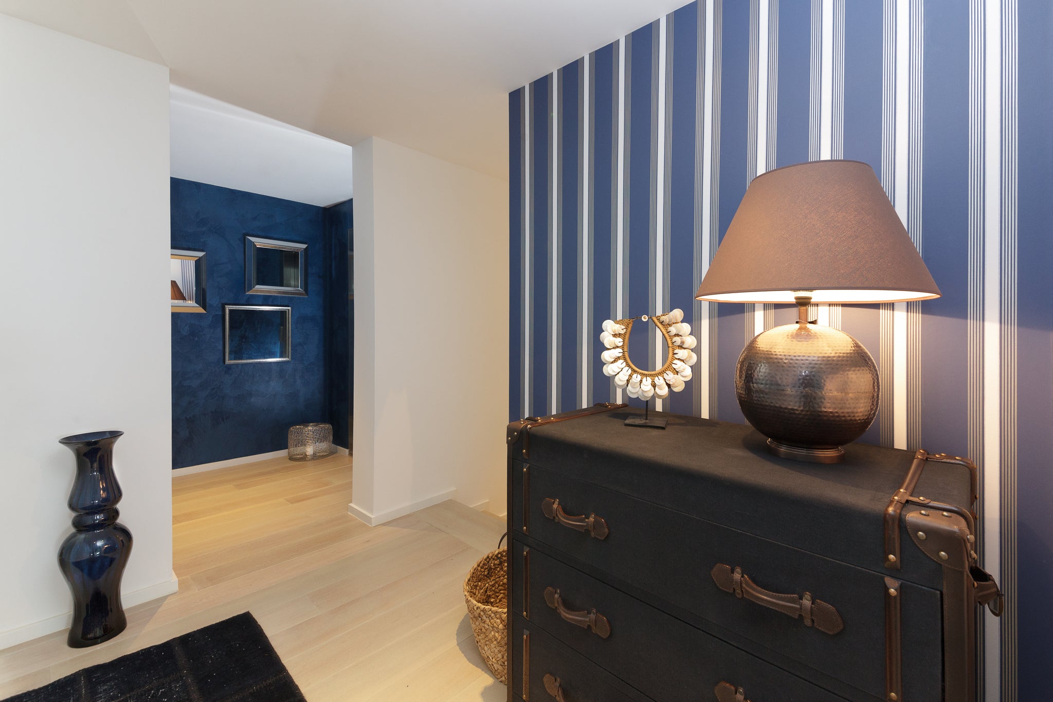
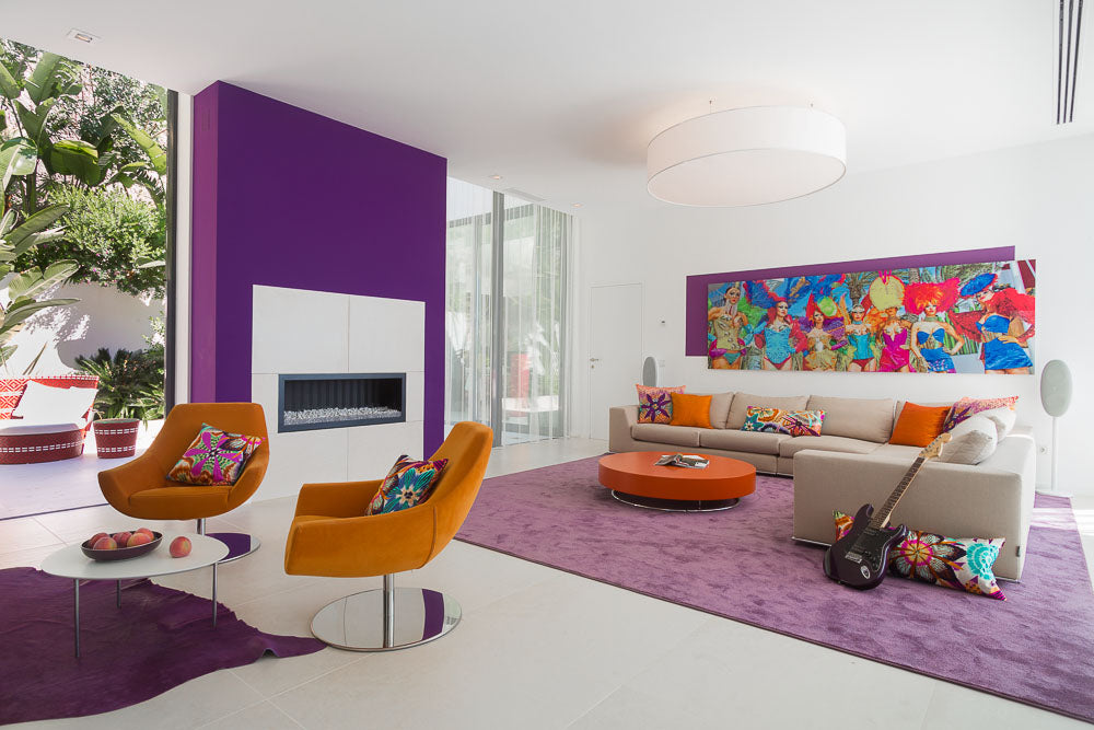
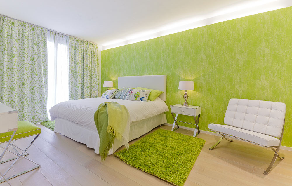
I have used this colour combination occasionally in my projects, such as in the living-dining room below.

Pantone 2021 Living room

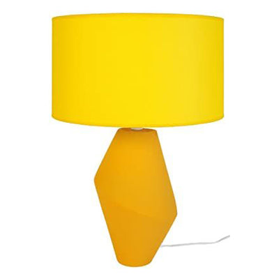
Yellow is excellent for uplifting the mood of contemporary rooms with a predominance of marble, mirrored glass, chrome and greys. I deliberately added splashes of pineapple and lemon in this otherwise clinical space using cushions, a bright coloured vase and yellow spring flowers. Bright yellow helps to brighten up ambiances, placed in different areas of a room, whether in the shape of a contemporary table lamp or a custom-made wooden sideboard.

Yellow Lamp Yellow Sideboard

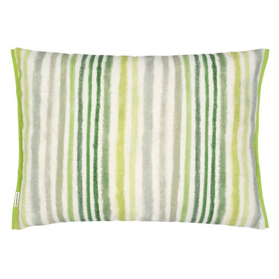
On the other hand, grey is a highly versatile tone, which I often use to tone down ultra-colourful décor. For instance, a contemporary chair upholstered in steel grey can be used as a dining chair or as a spare standing unobtrusively in a corner of the room.
And, as Pantone proposes, these two colours can work well together too. Combining nicely in upholstery, where the same geometric pattern is matched in gold and charcoal.

Grey Chair Geometric Armchair and Cushion

Here a version of the attractive grey and yellow honeycombed wallpaper is used in a project featuring a flaxen yellow sofa.

Sofa in Set Wallpaper
"Creating homes you will never want to leave"

Colour of the Year 2020

Colour of the Year 2020

Classic Blue - PANTONE 19-4052

I was excited earlier in the month to discover that Pantone’s colour of the year 2020 is Classic Blue. Blue is a colour I always try to blend into my designs, in all its many wonderful hues, from deep navy to bright ultramarine, turquoise or cerulean; they all reflect the myriad tones of the Mediterranean sea and sky that envelop the island of Mallorca. “Blue, from an emotional, psychological standpoint, has always represented a certain amount of calm and dependability.  It’s a colour you can rely on”, says Leatrice Eiseman, executive director of the Pantone Colour Institute.

The image below shows how I have chosen to use classic blue in both paint and wallpaper to give a landing a feel of timeless elegance, setting off the clean lines of the bright white walls and light oak flooring. 

Villa Son Vida

The modern and functional design of the chair below, upholstered in classic blue fabric and black trim, illustrates the adaptability of this tone when compared to the exquisite side table with a shabby chic finish and matte bronze fittings. At Knox Design, our furniture store in Mallorca, you will find many of these items beautifully combined with other pieces of furniture and home furnishings in many different colours and styles.

I also love to add a touch of blue to an ambiance using blue tinted glass lampstands. Mallorca boasts a centuries-old hand-blown glass industry, so when I use it in my projects I am incorporating the heritage of this island’s craft tradition. For me, as a consummate diver and passionate sea lover, blue will always evoke the sea. The coral motif is one of my favourites, featured here on a cushion in a classic blue tone.


Blue has traditionally been considered a calming colour, so I often use it for bedroom décor. Classic blue is the presiding tone in the bedroom below; the rug, the flowered design of the curtains and wallpaper, the rich velveteen cushion on the rattan chair and the embroidered flowers on the throw pillows on the whitewashed four-poster bed combine to create a sanctuary of bright serenity and peacefulness.

Colour of the Year 2019

Colour of the Year 2019

Living Coral - PANTONE 16-1546

The Pantone Colour of the Year 2019 is Living Coral, described by Pantone as “an animating and life-affirming coral hue with a golden undertone that energises and enlivens with a softer edge”.

Take a look at this lovely bedroom, where the coral tones I have chosen clearly inject life and vibrancy to the space. The coral upholstered headboard and matching valance, coral flowered curtains and voile, coral striped pillows and coral, red and lilac poppy pictures on the wall harmonise with the white and cream of the walls, rug and nightstand to paint a bedroom that promises a happy wake-up every morning.  

Villa Cala Egos

Whether in plain linen or enmeshed in a criss-cross pattern, coral colours are perfect for adding warmth to any décor. You will find a full range of fabrics in coral tones and featuring coral motifs at our Knox Design furniture store in Son Bugadellas, Mallorca.

Solid colour cushionCriss cross CushionCoral HandbagCoral Art

In the words of the PANTONE Colour Institute, “Living Coral is evocative of how coral reefs provide shelter to a diverse kaleidoscope of colour.” As an enthusiastic diver who travels the world’s oceans to admire the wonders of underwater beauty, I am thrilled with this year’s choice; I have managed to work it into many of my projects this year and it is one of my favourite motifs in household items and gifts available at our Knox Design store. Check out the gorgeous bag and the simple, yet exquisite, picture below.


As a colour, coral is not just limited to marine motifs. I often use it in my home design projects to add warmth and earthiness to spaces, as it combines beautifully with a many other chromatic ranges. For example, I have opted for tones of living coral in the bedroom below, featured in the stunning wallpaper of bright-coloured plumeria flowers, leaves, butterflies and flamingos against a backdrop of turquoise, plus matching pillows.

Colour of the Year 2018

Colour of the Year 2018

Ultra Violet - Pantone 18-3838

Ultra Violet, Pantone colour of the year 2018 is a complex colour: on the one hand, it symbolises experimentation and non-conformity, which I find very appealing given my love of bold colour schemes. But Ultra Violet also has a mystical and spiritual quality, often associated with mindfulness and quiet reflection. As an interior designer, I am fascinated by the duality of Ultra Violet, which I have sought to incorporate into my projects this year.

I have thoroughly enjoyed the audacity required to work ultra violet into larger spaces. Check out the stunning lounge in the picture below, where purples and oranges create a daring and vibrant mood in a modern villa in Port d’Andratx (Mallorca). From solid ultra violet on a wall, rugs and back panel to contrasting tones on soft fabrics and artwork, competing with turquoise, mandarin, fuchsia and cerulean blue.

Villa Port Andratx

There is something truly magical about ultra violet tinted glass. The Flam et Luce Topaz lampstand below, combined with its burgundy shade, adds a touch of mystical elegance to any corner of a room, while the Maison Berger Resonance Lampe, designed by Sylvie de France to resemble a cut diamond, is an authentic objet d’art. All these fabulous items are stocked at the Knox Design Store, our furniture store in Mallorca.

Purple LampMaison BergerPurple ChairPurple and Green Pillow

Ultra violet, as all other shades of purple, can be a powerful accent colour to be added to spaces through soft fabrics, as is the case with this modern chair designed by Angel Cerdá, upholstered in ultra violet linen on a black epoxy painted steel structure. It is also a very versatile tone, featured here in this exquisite Missoni classic patterned cushion with garnet, military and moss green, cream and light blue.


In the pictures below, I chose to incorporate ultra violet into the colour scheme of an apartment in Puerto Portals (Mallorca). I took a risk when I chose the unorthodox pink and purple tones of the vitreous ceramic mosaic tiles on the shower walls, but we were all elated at the result. I then carried a much more attenuated version of purple into the bedroom, on curtains and throws, cushions and headboard, for a sumptuous and elegant feel.

Apartment Port Portals Apartment Bendinat

Colour of the Year 2017

Colour of the Year 2017

Greenery - Pantone 15-0343

Pantone’s colour for 2017 is Greenery. Described as “a fresh and zesty yellow-green shade that evokes the first days of spring when nature’s greens revive, restore and renew”, it feels very familiar to me, as I have been using this tone for years in many of my interior design projects, in an effort to blur the line between indoor and outdoor living.

This spacious bedroom in a villa in Son Vida (Palma- Mallorca) is an excellent example of the use of green to create a cool and summery atmosphere. Set against bright white, it is echoed in the flower-patterned curtains, the wallpaper, cushions, stool and throws, for a light, restful and uplifting feel.

Villa Son Vida

Green tones can be easily worked into any interior décor. Below is a leaf shaped placemat from Andrea House and a green gloss ceramic vase by Asitrade, whose simple lines can easily grace any corner of a home. Both items can be found at our furniture store in Mallorca.

Leaf PlacematGreen VaseGreen TowelsGreen Cushion

I find that regardless of the main colour scheme of a project, a way to add a touch of freshness to a home is through the clever use of soft furnishings and home textiles. The soft striped pillow in an array of green hues, by Designers Guild, is a wonderful addition to bedroom décor, while the luxurious set of Designers Guild towels in this year’s greenery tone helps to add a touch of nature to a bathroom.


Check out the use of green towels in this bathroom also from the villa in Son Vida. A touch of clean freshness against a backdrop of white ceramic and cream marble panelling. I added green into the TV lounge of this older villa in Bunyola to give it a revitalising freshness, both in the rug and the artwork on the wall, adding a splash of colour to an otherwise serene and neutral space.